M is Not for Martha
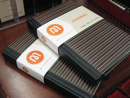
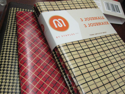
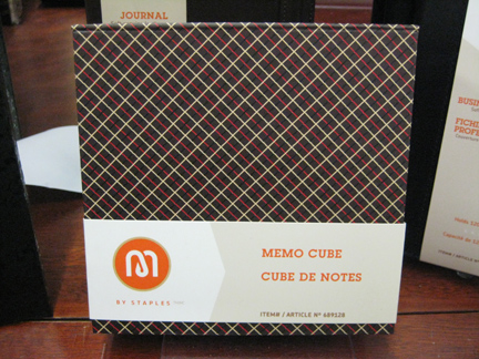
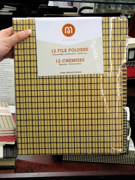
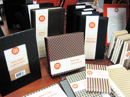 An interesting brand caught my eye as I made a quick trip to Staples recently. “M” by Staples is a line of fancy stationery and office accessories which aim to capture a new design-forward audience within the context of its decidedly utilitarian… well, staple items. All items feature smart, stylish patterns which are held together graphically by a giant orange “M” logo. The logo itself is quite intriguing, as it has an overlapping coil which seems to look like a paper clip. Graphically, this is a much more successful logo than the Staples logo itself (the “L” in Staples weakly implying a bent staple). The real mystery here is exactly what “M” stands for. My first thought was that it was a Martha Stewart brand, but this does not appear to be the case. Nonetheless, it’s a welcome change to the typically bland selection of such items in the store. I’m sure the decision to give English and French equal prominence on the package fronts was more marketing-driven than anything else, giving it a Euro panache. Overall, it’s a very nice looking suite of materials.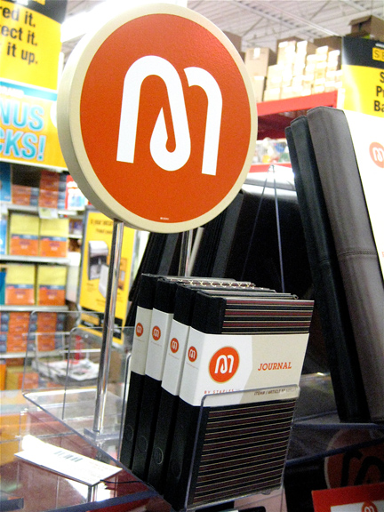

Want To See More Content About Award Winning Art + Design?
Stay up to date with expert information on the ever-evolving beauty industry. We share the best practices brands are using to connect with consumers in new and meaningful ways.
More Like This
Plastic Bag Happenings at Kiosk
As you already know I love Kiosk. And as you already know, we hate plastic bags. Therefore it should come ...

Pop Art on the Roof
One of the things I love about summer in NYC, is hanging out at a rooftop garden or bar and ...

A Better Reusable Bag
Last week I was in Italy for a wedding, and I noticed this reusable grocery bag in a supermarket. (They've ...