Pana-Mime
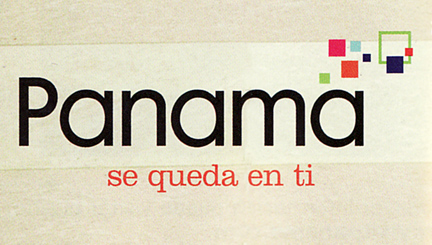 I came across this logo for Panama tourism in a magazine the other day. Does the colorful cluster of shapes look familiar? A little too familiar perhaps? That’s because it is! They totally ripped off the Bahamas logo! Ok, while I couldn’t verify that the Panama logo was designed after the Island of the Bahamas logo (small technicality), I can say that they certainly don’t wear it as well. Judging by this logo, I would think Panama is an IT company… Click below to see the (far more successful) Bahamas logo, designed by Duffy & Partners in 2005.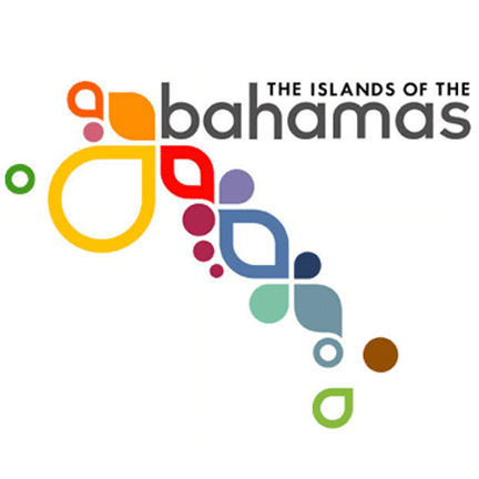
Want To See More Content About Award Winning Art + Design?
Stay up to date with expert information on the ever-evolving beauty industry. We share the best practices brands are using to connect with consumers in new and meaningful ways.
More Like This

MSLK Takes it to The Gutter
Sheri always tackles the highly technical bowling interface. After our first failed attempt in December to have a MSLK bowling ...
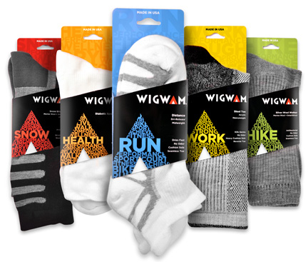
MSLK’s New Wigwam Packaging: A Focus on Performance
MSLK has recently been busy working on completely new packaging and overall branding for Wigwam Mills, and it's getting ...
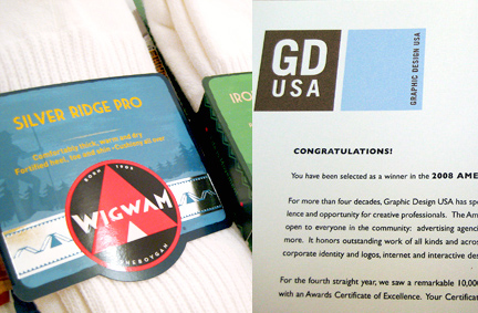
MSLK Wins an American Graphic Design Award!
MSLK has won an American Graphic Design Award from Graphic Design USA for the Wigwam Packaging Re-branding. Over 10,000+ were ...