Store-Brand Packaging
 Coincidentally I was also noticing the grocery isles the past few days while in Florida, taking note of Publix’s in-house brand packaging. In a similar vein to tampon packaging, the history of store-brand packaging isn’t a pretty one. In an effort to compete with name brands, grocery/drug stores have tried a variety of tactics, ranging from mimicking the most successful packaging to inconsistent systems with different packaging per product. It seems to be a challenging task for a grocery store to brand itself among third party products. I was pleasantly surprised to find that Publix, a southern grocery chain, seems to be doing something right. The packaging system is simple enough – silhouetted imagery (photography and illustration) on a clean white background with prominent color coding to distinguish each product within a category. In almost every instance, the Publix brand cut through the clutter on the shelf and drew my attention.
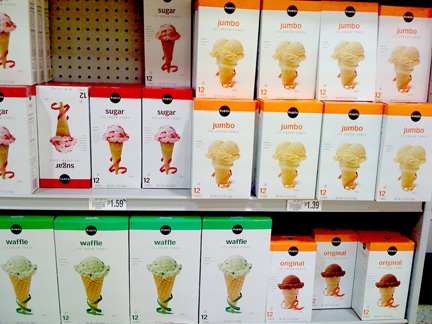 While the packaging design may not be perfect, it’s certainly successful in standing out on the shelf and providing a clear system to distinguish products.

Want To See More Content About Award Winning Art + Design?
Stay up to date with expert information on the ever-evolving beauty industry. We share the best practices brands are using to connect with consumers in new and meaningful ways.
More Like This
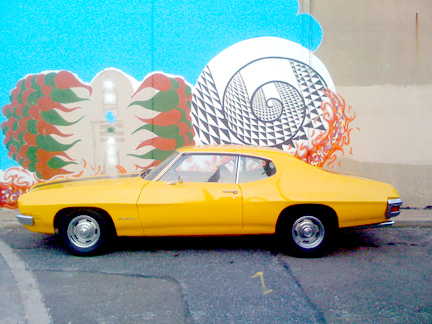
Classic + Modern
I'm not a big car person, but I tend to have a soft spot for certain vintage cars. I find ...
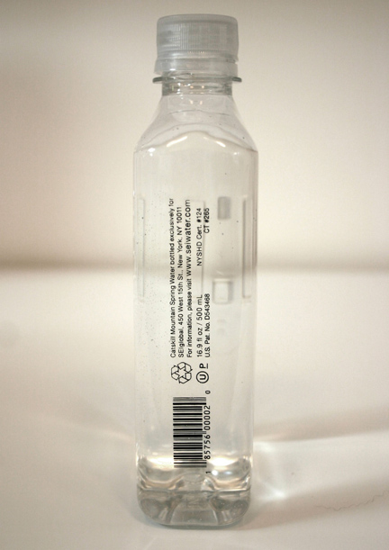
SEI The NEW Water
Sleek!!! I love how simple the design is and how slim the bottle is. The inspiration came from a military ...

MSLK’s Top 12 Thank You Cards on Felt&Wire
There's more than one way to say thank you and a great way to show your appreciation is with a ...