Time After…
 The other night at the AIGA gallery I saw Norman Ives retrospective — one of our profession’s celebrated (if lesser-known) masters. I couldn’t help but notice a logo he had designed long ago which had a striking resemblance to a more modern logo…
  The Time Warner logo, designed by another one of our profession’s luminaries (and former boss of your’s truly) Steff Geissbuhler, undoubtedly bears striking similarities to the Ives logo. It’s completely possible that Steff could have designed this logo without ever seeing Ives’s work. This is unprecedented in the world of design, art, music. Never been a huge fan of the Time Warner eye/ear logo, I certainly respect the brazenness it had during its launch, and its overall quirkiness and memorability. Love it or hate it, it was quite appropriate for a media conglomerate dealing in all things audio and visual. Unfortunately, it was the boldness of the Time Warner logo that was its ultimate demise. Immediately after its launch in 1993, the logo was soon dropped within 36 months from nearly all corporate communications, relegated to serve as the identifier for the cable division where it’s still used. It’s been since replaced by an ever-changing cast of forgettable typeface, each one weaker than the next (none of which were even designed by a design…more details here):


Want To See More Content About Award Winning Art + Design?
Stay up to date with expert information on the ever-evolving beauty industry. We share the best practices brands are using to connect with consumers in new and meaningful ways.
More Like This
Let’s Not Be Stupid
This free sticker was the best part of a lecture the studio went to tonight.
Pana-Mime
I came across this logo for Panama tourism in a magazine the other day. Does the colorful cluster of shapes ...
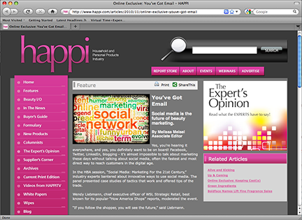
MSLK’s “social media: marketing for the 21st century” featured in happi magazine
MSLK's Sheri L Koetting was mentioned in Happi's coverage of the HBA session, "Social Media: Marketing for the 21st Century." ...