Pana-Mime
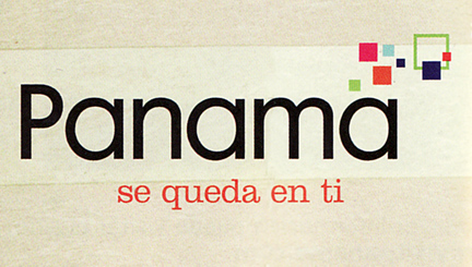 I came across this logo for Panama tourism in a magazine the other day. Does the colorful cluster of shapes look familiar? A little too familiar perhaps? That’s because it is! They totally ripped off the Bahamas logo! Ok, while I couldn’t verify that the Panama logo was designed after the Island of the Bahamas logo (small technicality), I can say that they certainly don’t wear it as well. Judging by this logo, I would think Panama is an IT company… Click below to see the (far more successful) Bahamas logo, designed by Duffy & Partners in 2005.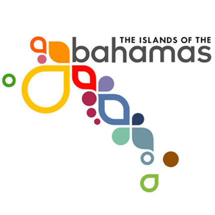
Want To See More Content About Award Winning Art + Design?
Stay up to date with expert information on the ever-evolving beauty industry. We share the best practices brands are using to connect with consumers in new and meaningful ways.
More Like This
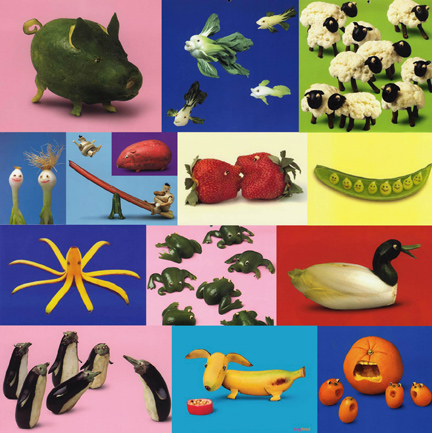
Imagination In The Kitchen
Vegetables + Fruits + Imagination = VegFruMation With a touch of craftsmanship and creativity someone out there is having some ...

iHeart
Sheri made these awesome cases for our phones. I love mine! So much better than the old sock I was ...

Fischer Landeau’s Urban Oasis
A tree might grow in Brooklyn, but here in Long Island City, palm trees grow. I snapped this while biking ...