Separating Fat from Fiction
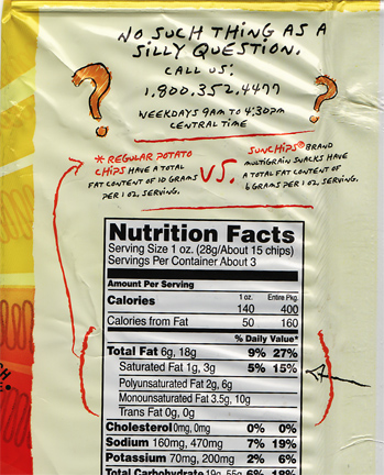 Sun Chip’s new packaging makes an attempt to speak to consumers about the product’s nutritional facts in a clear, friendly manner. It’s great how they are using handwritten graphics in conjunction with the cold, FDA-mandated nutrition facts (which happen to have a Vignelli-inspired heavy black-lined design employing Helvetica). A nice touch, especially since package backs typically aren’t used for “selling.” There’s some other do-gooder facts to be found on the back, as well.
 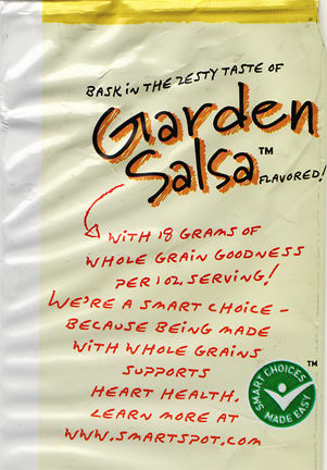 Little handwritten facts about the virtues of whole grains. The green badge is a 3rd-party endorsement which their website describes as “…a quick way to be sure that the products you’re choosing are contributing to a healthier lifestyle.” We like that, right?
  A sponsorship program to help benefit breast cancer research. Is this any of this award-winning design? No. But it’s a nice example of a company taking steps to help consumers and others, using friendly graphics which are appropriate to their cause. On the flip side, while I understand that we might not ever see an organic version of this Frito-Lay-owned brand any time soon, I would like to see a few less oddball ingredients listed like “DISODIUM PHOSPHATE” and “RED 40 LAKE.”
Want To See More Content About Award Winning Art + Design?
Stay up to date with expert information on the ever-evolving beauty industry. We share the best practices brands are using to connect with consumers in new and meaningful ways.
More Like This
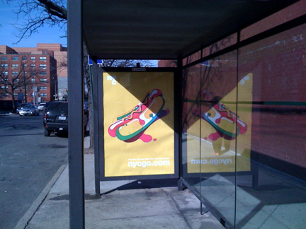
Nycgo.com: an amazing advertising campaign brings warmth, joy
While it has been brutally frigid in NYC this winter, my walks outside have been made warmer by seeing this ...
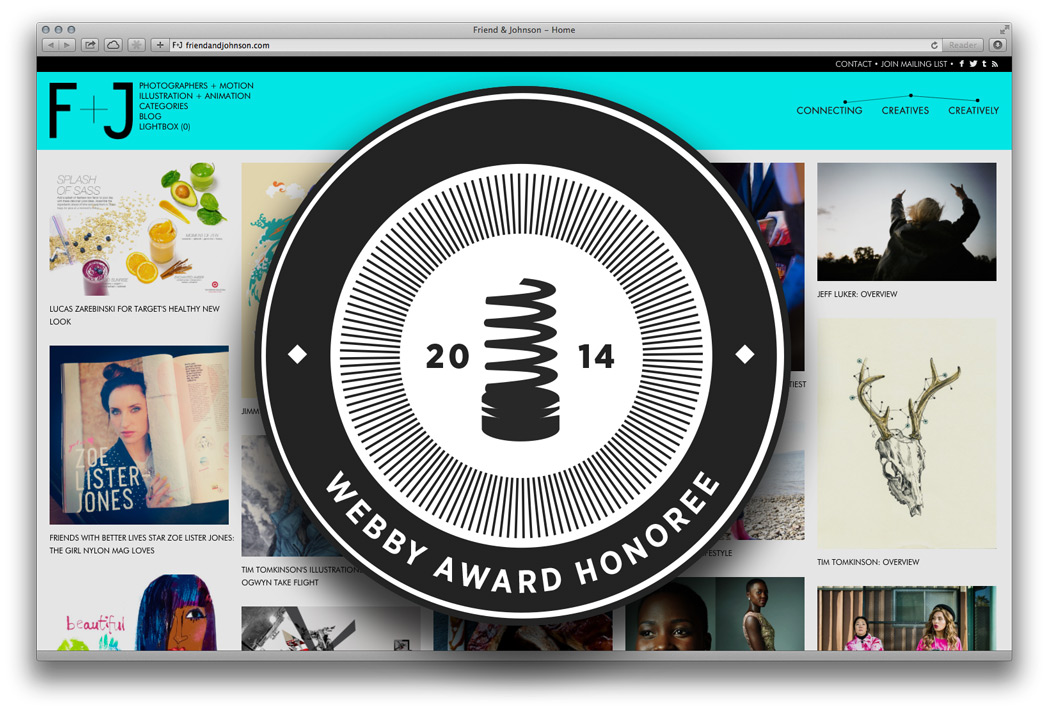
MSLK Honored in the 18th Annual Webby Awards
For Immediate Press Release: Long Island City, NY — April 10, 2014 MSLK announced today that their website design for ...
Five Tips to Improve Your Marketing
Businesses cannot afford to simply wait for the economic picture to improve in order to increase their bottom line. It ...