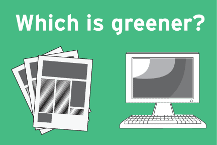

Make Your Website Green
Did you know that it's possible to make your website completely carbon neutral and energy efficient? This is something that all of us as individuals can easily do to reduce...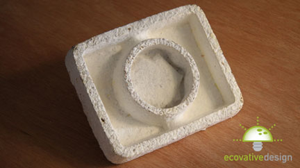
Mushrooms to Replace Plastic! (I hope)
Eben Bayer and Gavin McIntyre have developed a material they call Ecocradle, which feels, functions, and looks almost exactly like styrofoam. It is comprised entirely of organic matter,with mushroom roots...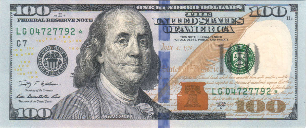
New Hundred Dollar Bill Design Looks Cheap To Me
New Rule: If you're going to redesign your highest denomination, then hire a designer! This is an abomination which appears to have been driven by no aesthetic principles. Just a...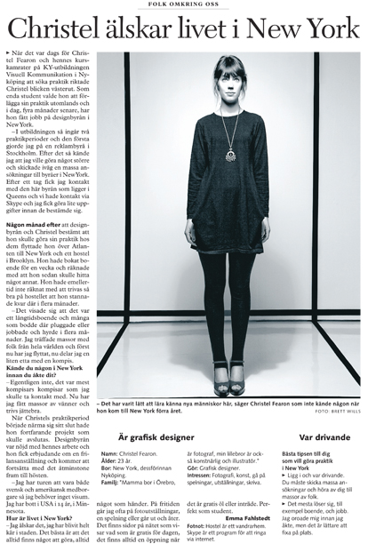
MSLK Designer Christel Fearon gets Recognized in Swedish Media
The Swedish newspaper SN recently contacted me to talk a little bit about my move to New York and my new job at MSLK. As the article's in Swedish I'll...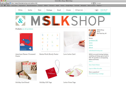
MSLK’s New Shop on Felt & Wire
Throughout the years MSLK has created a number of designer posters, cards and tags that are available in our online shop. We see it as a great way for our...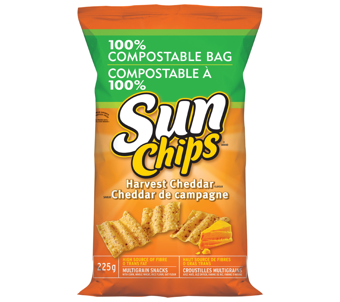
Sun Chips New Commercial Featuring Their Leave No Trace Compostable Packaging
The commercial states. "If we all made a change, it could lead to some pretty amazing things... A bio-degradable bag made from plants is Sun Chips change for a better...
Take-Less: MSLK’s New Eco-Art Installation
Over the past few years, MSLK's eco-art installations have raised awareness about society's mindless consumption of plastic. This year we will be focusing on the unnecessary plastic waste produced by...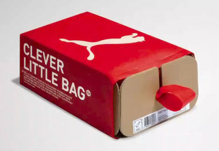
Puma Redesigns Shoebox into “Clever Little Bag”
We love it when people think outside of the box, literally! The Sportlifestyle company Puma has been working together with the branding firm Fuseproject to create a whole new take...