PruCheek is a brand whose sassy sense of humor fills a void in the niche market of cards for people of color. While competitors’ cards tend to focus on ethnic colors, cultural imagery, and messages of empowerment, PruCheek connects with its audience in a different way. Bold, bright, and outrageous, these cards speak the previously unspoken, giving a voice to a new generation. Our job was to help PruCheek capture the attention this product deserves.
Read project brief Read project brief
1. CHALLENGE
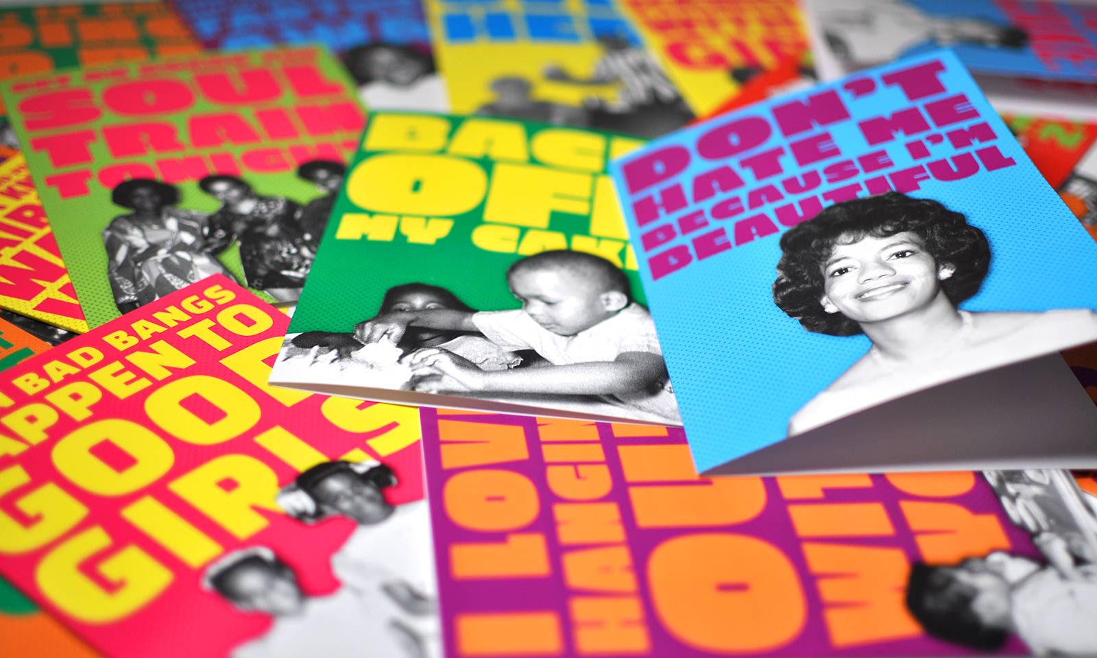
PruCheek is a line of greeting cards for people of color. Different from their competitors, these cards do not feature traditional ethnic sayings, graphics, or colors. They feature cheeky, sassy language and humor. April Pruitt, the owner, came to MSLK with great ideas and potential, but had product implementation issues. Retailers were drawn to the copy and message on each card, but the previous card design and quality of production wasn't up to snuff. PruCheek needed a distinctive visual brand identity that reflected the attitude and written voice on the cards themselves.
2. STRATEGY
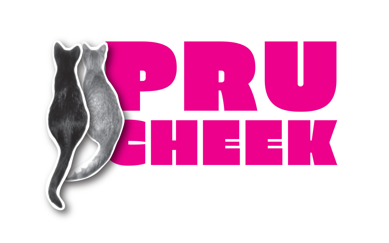
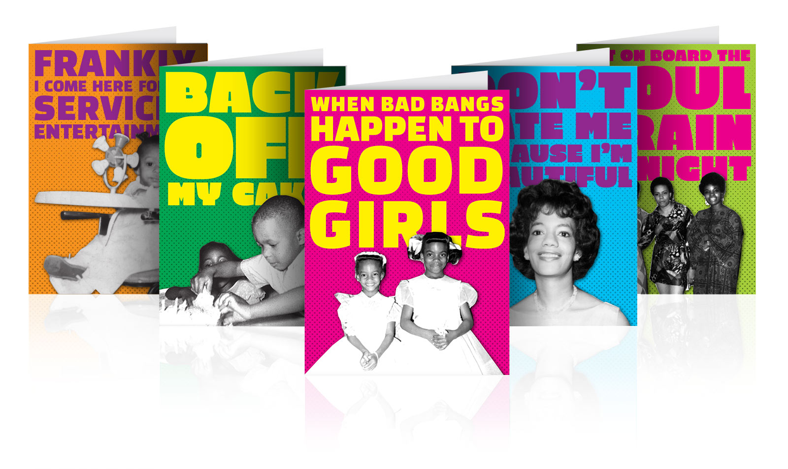
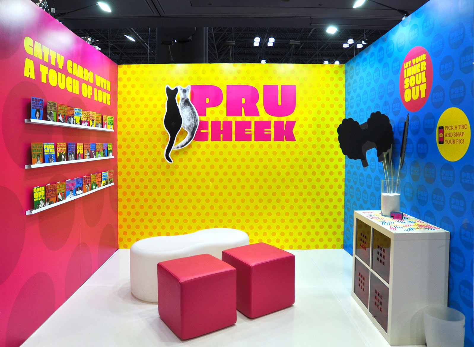
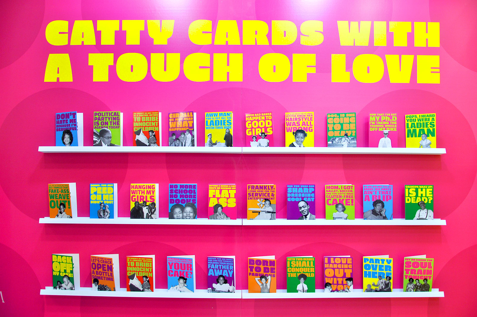
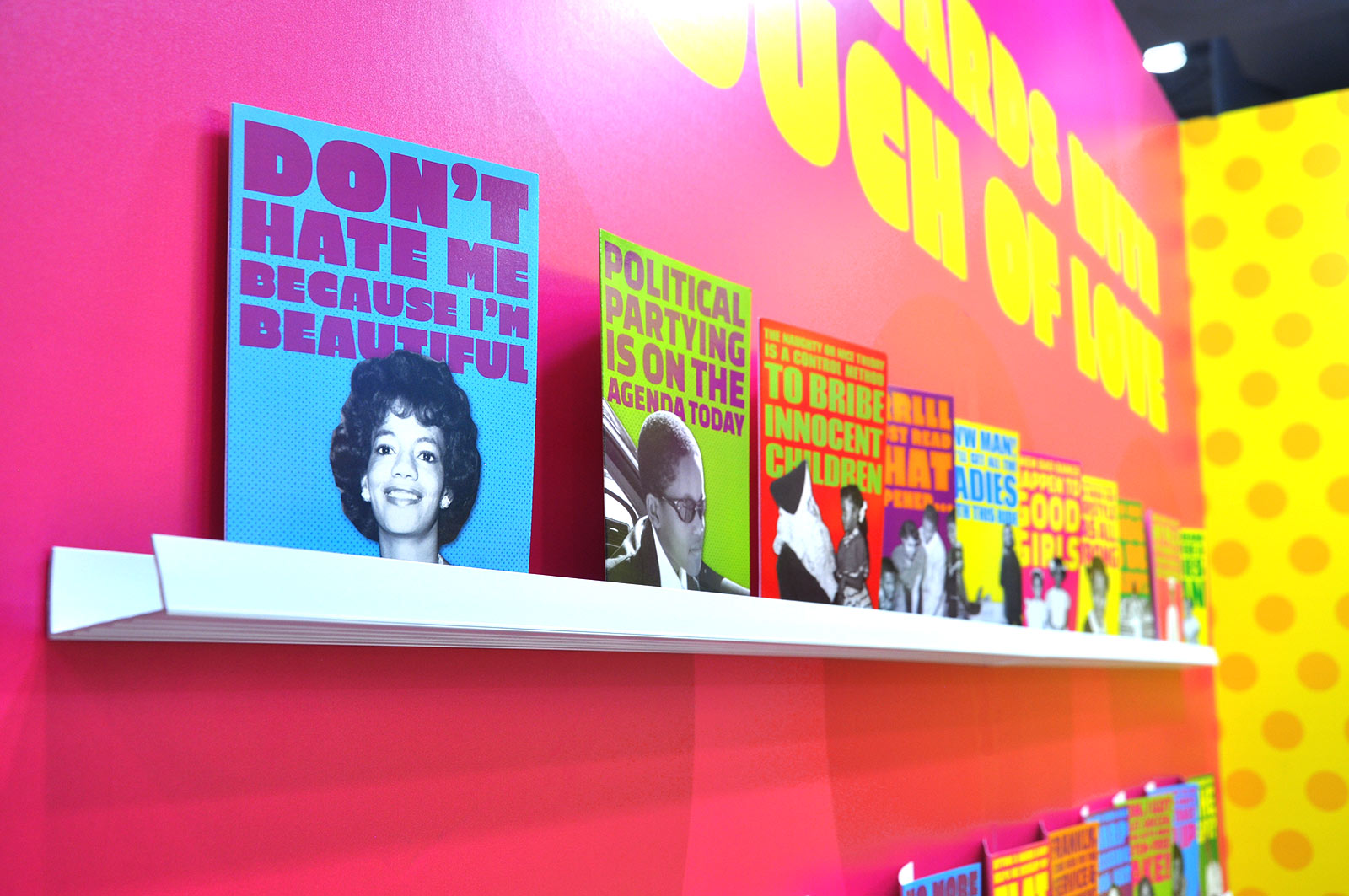
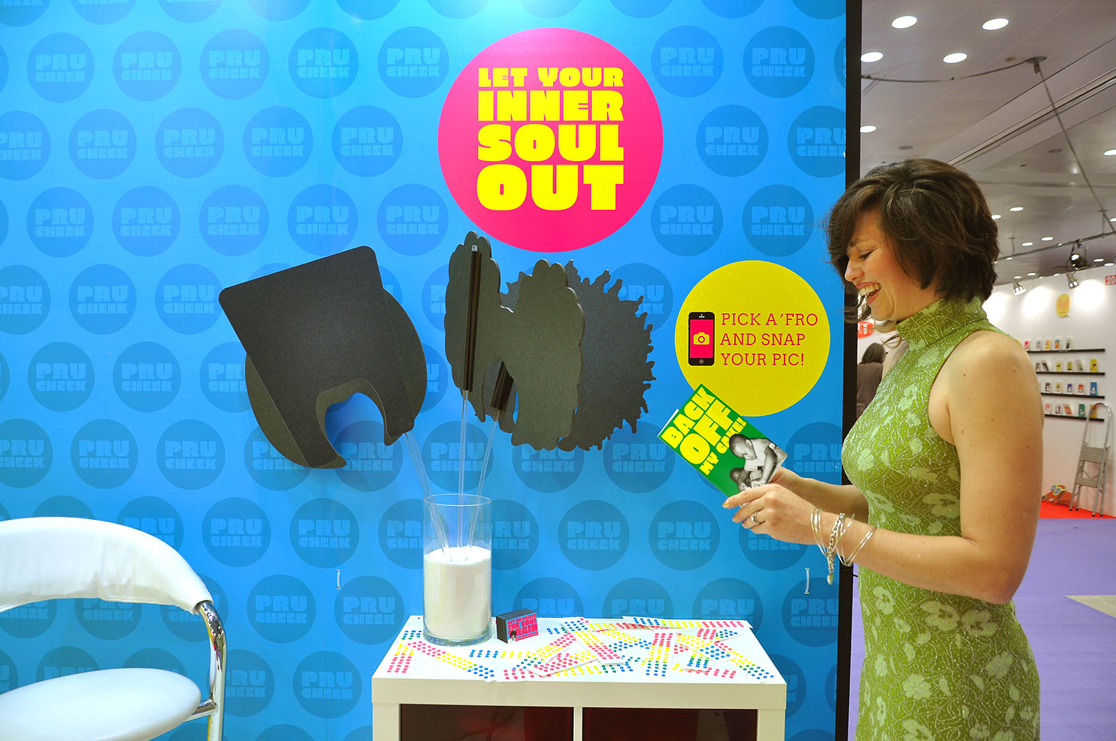
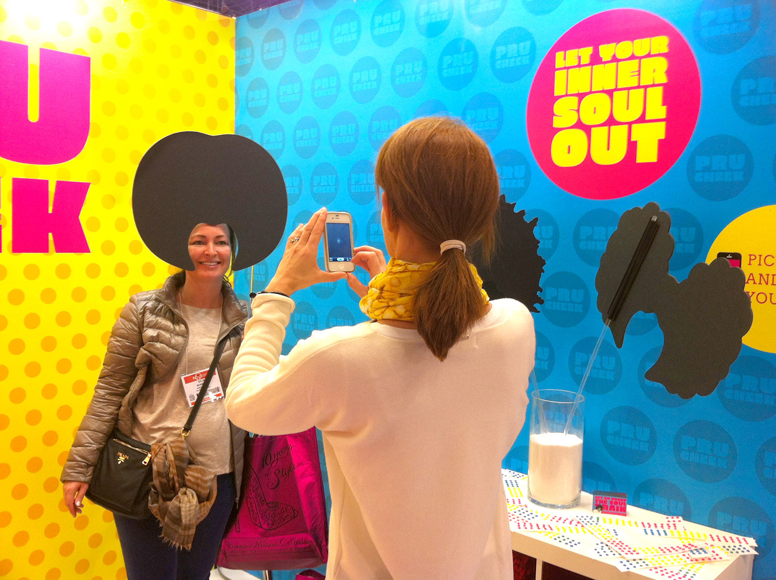
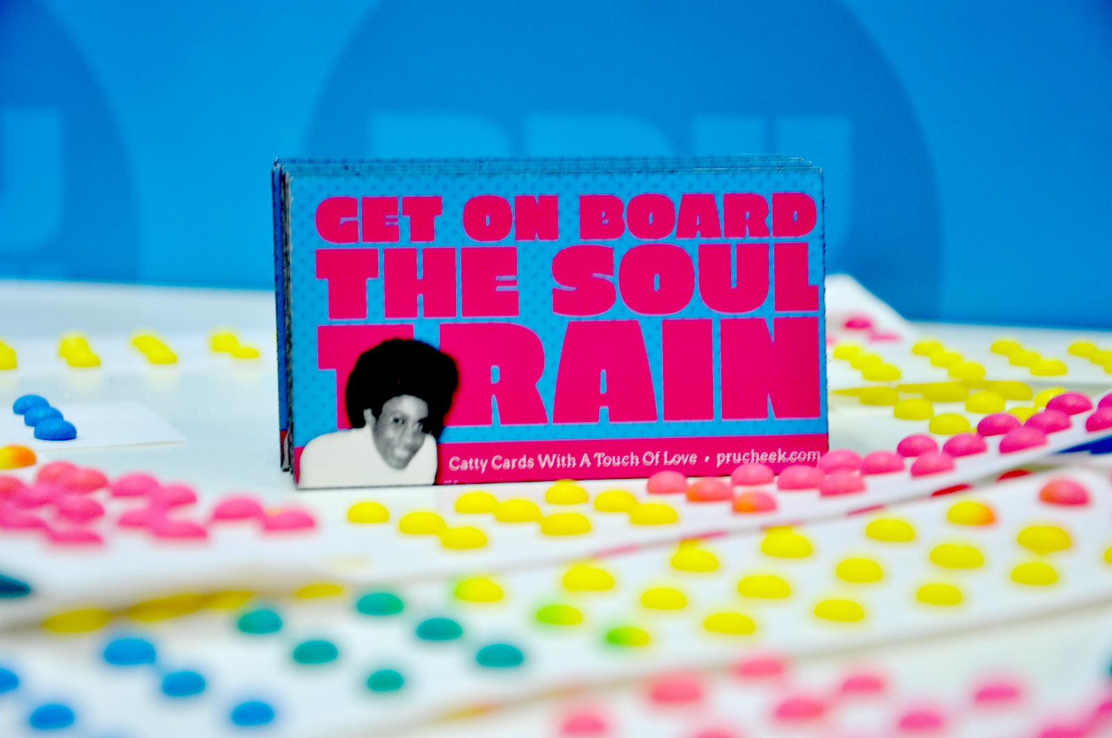
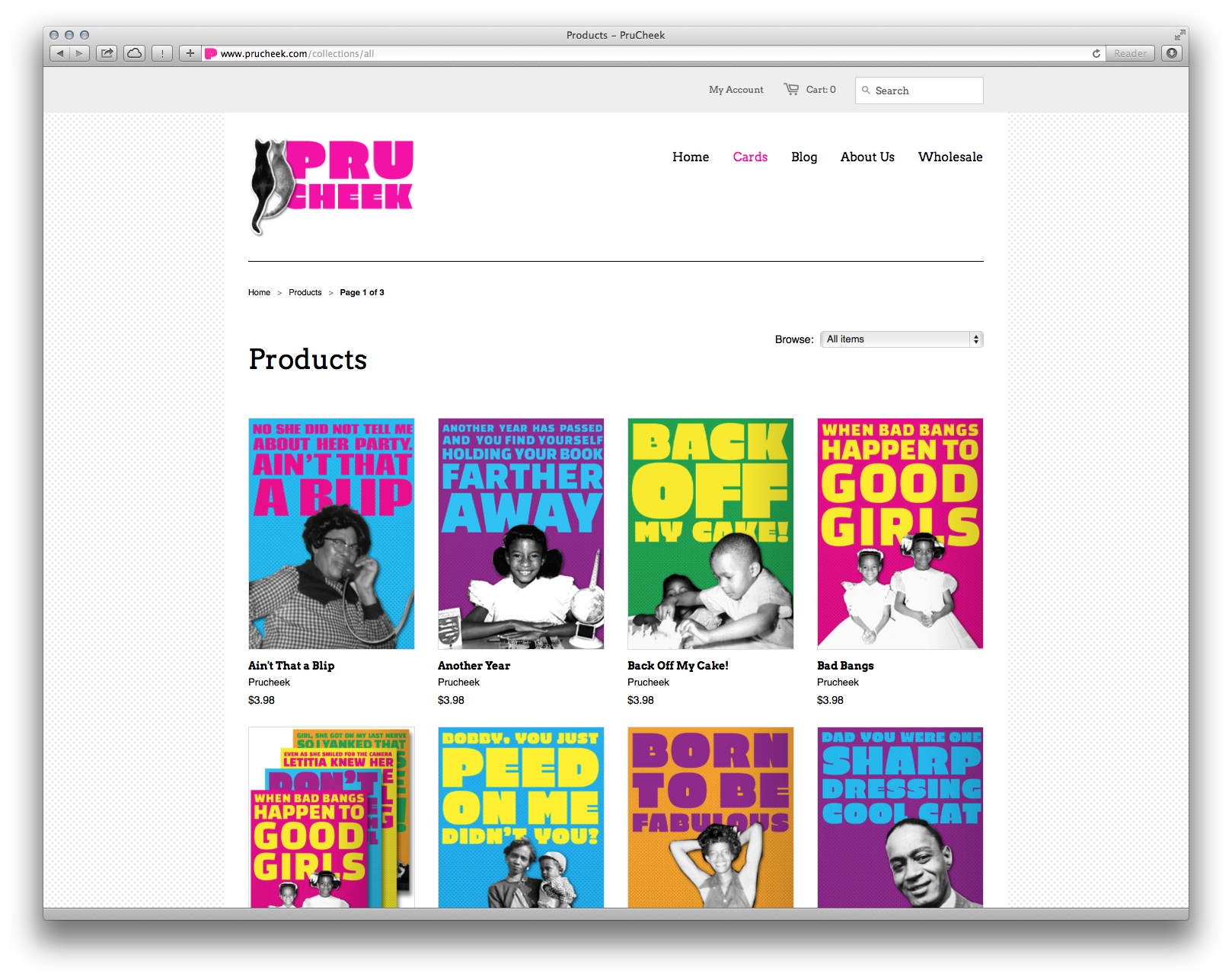
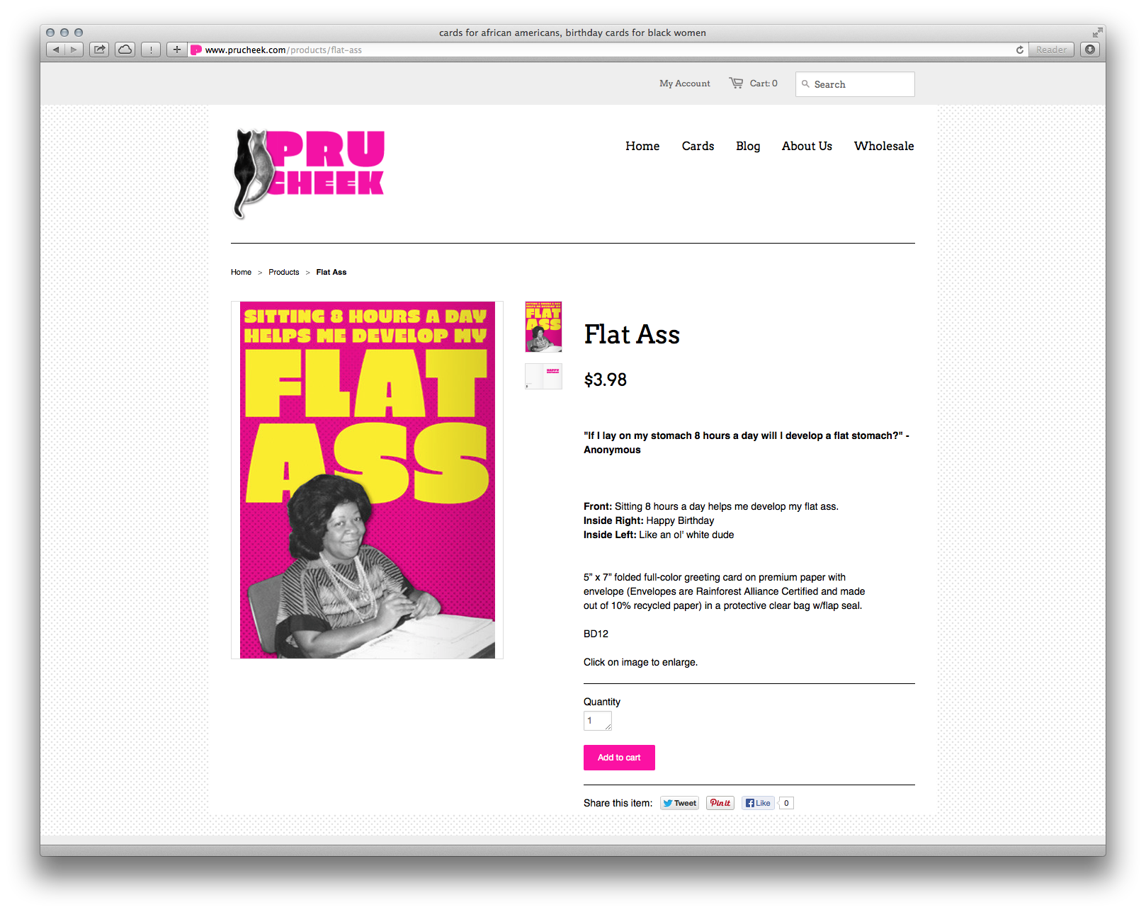
An audit of the previous cards determined there were several existing brand elements worth keeping. Besides the great copy and overall brand voice, the cards had a strong history of featuring retro photography. In addition, many of the cards featured two cats adding their own snarky commentary. Since the cats' comments truly added a twist of sass to the standard "Happy Birthday" card, they inspired us to create a new tagline: "Catty Cards with a Touch of Love." Because the PruCheek brand was only partially known to retailers, we developed a strong product launch strategy which included press and sales kits, trade advertising, tradeshow booth, e-commerce website, as well as an engaging "Let Your Inner Soul Out" in-person and social media activity.
3. DESIGN
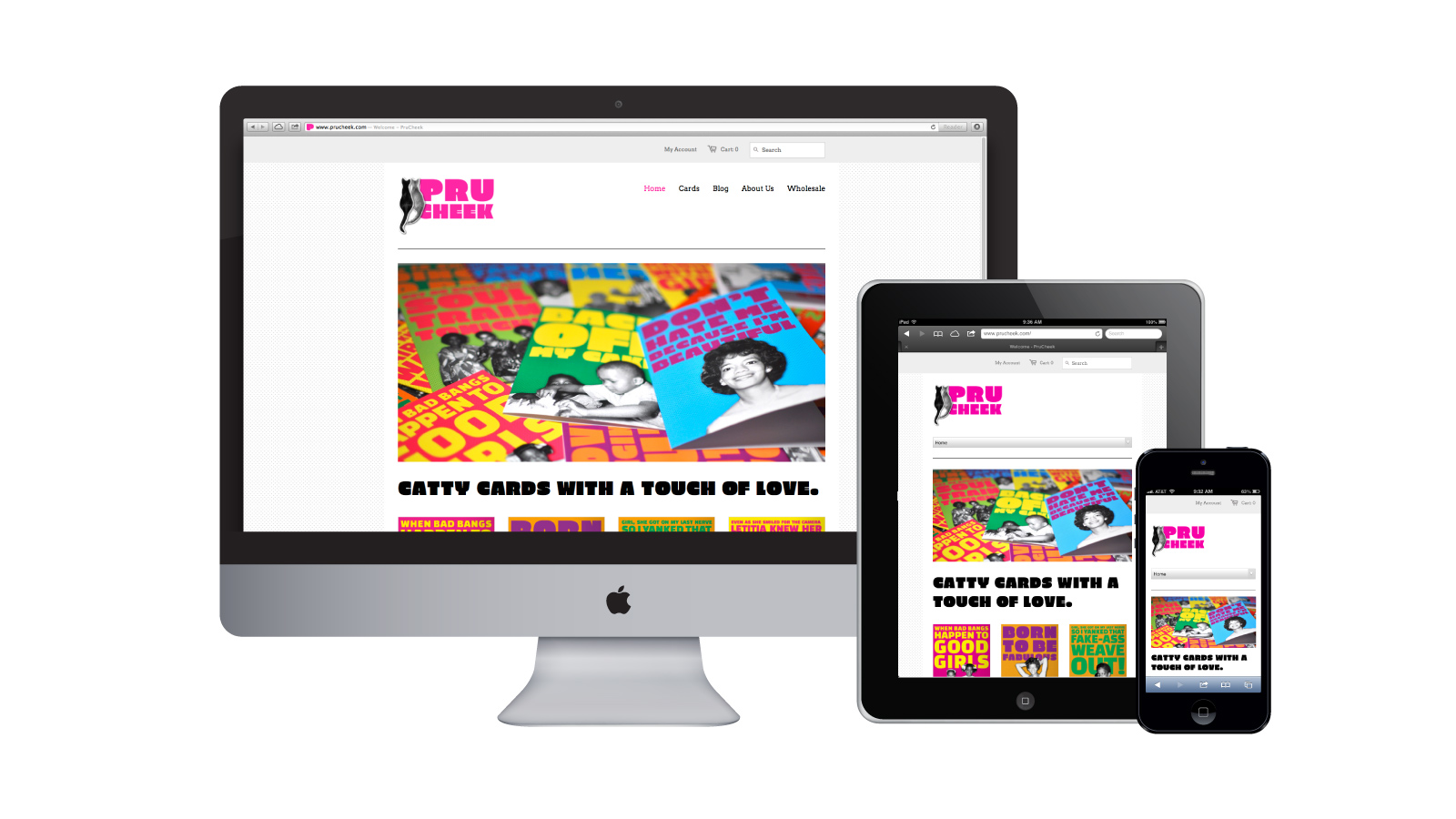
Across all elements our bold, retro design captures attention from across the room. Truly a kit of parts, the brand includes a palette of six colors, three quirky typefaces, and a stylized, halftone dot treatment for photography, which allows us to maintain a consistent and memorable look. Our e-commerce solution has truly become the hub of the brand. Here, they can take retail and wholesale orders as well as build and promote the brand ethos. Our "Let Your Inner Soul Out" in-person event captured people's attention and hearts. PruCheek was able to make friends and fans of all races encouraging people to pose with the Afro of their choice and customize their social media profile pic. This activity drew retailers and press into the booth as well.
4. SUCCESS
April Pruitt, the creator of Prucheek, could not have been happier with the result. She said it best herself at our first presentation. "I had no idea what you were going to do would be that different. You were able to create what was in my head but wasn't able to voice. I've never gone this far before. I'm so glad that I've done this; I have tears in my eyes..." Buyers who had previously told her that the design and quality of the cards weren't up to par, are now eager to take a second look. PruCheek has even garnered attention from buyers at Target, Walmart, American Greeting Cards, and Fab.com. April's new assessment is, "I think I can comfortably say the cards are not just on-trend but setting the trend!" Within only a few months after the re-introduction, 78% of stores carrying the new cards were sold out, with 83% having re-ordered before end of the year.